The Japan Society invited me to review IRO – the essence of Colour in Japanese Design by Rossella Menegazzo, these are my impressions.

Rossella Menegazzo, the co-author of the best seller Wa – The Essence of Japanese Design, starts this book by asking us a simple question –
“What colour is Japan. Is it red like the prominent circle of the Japanese flag, or the outlined lips and eyes of a geisha against her white foundation, the dramatic lines painted on a kabuki actors face, or the wood lacquers and pavilions in Japanese shrines ?”
Simple questions often have complex and nuanced answers and as Menegazzo points out, when it comes to colour we all have an individual emotional response. For example, I am personally drawn to the deep Indigo blue of Japanese dyes used in fabrics of all kinds and, if we are not being too picky about tones and hues, also in the prints of Hokusai. For many people however, it’s the muted monotone colours of Muji and the polished concrete greys of Ando Tadao’s buildings that do it for them. No doubt you will have your own favourites, a reminder of your connection with Japan.
From this insightful first chapter – ‘Chasing Ghosts, Traditional Japanese colours, from nature to design’ (page 5-9), we are taken on a fascinating journey of colour in the context of Japanese culture and history.
Menegazzo explains how, as with many aspects of Japanese culture, the natural world is of fundamental importance to the creation, use and meaning of colour. How the Kanji (Chinese character) for colour – IRO 色 – like many Kanji has expanded its meaning beyond describing the colour itself, to include facial expressions, landscapes and aspects of sexuality and eroticism. And, how in the epic Heian period (794-1185) novel Genji Monogatari (Tale of Genji, c.1008) by Murasaki Shikibu, colour and nature were used in the names and nicknames of key characters.
It won’t be surprising to those who study Japanese culture to learn that complex rules were applied to the use of colour, as Menegazzo observes (page 5) –
“No curtain, screen, ribbon, fan or piece of writing paper was chosen and used without considering the sophisticated and complex rules – inspired by nature – that defined its shape, material and colours…”
Through a whistle stop tour of the great periods of Japanese history – from Nara (710-794) upto Modern day, we learn how each period had its own set of aesthetic rules applied to the appropriate use of colour as influenced by the prevailing cultural, political and social issues of the day. These, as in western cultures, were led and practiced by those in courtly life and leadership. But we also learn how the practice of Zen philosophy and its focus on austerity, modesty and simplicity grew to become an alternative strand of aesthetics, ultimately leading to the tea ceremony and the practice of Wabi Sabi we hear much of today. This strand promoted the creation of colours such as the muted shades of green, brown and ash we might associate with the more urbane Japanese fashion brands of today.
From a designers view point, what I love about this book is that it puts Japanese people and their relationship with colour into sharp focus. For example, I have often wondered why Japanese companies use, from a western market view point, what appear to be weak and often layered and gradated colours.
Menegazzo perfectly explains this cultural phenomenon by pointing out the Heian period court practice of layering items of clothing to create a specific hue or gradation of colours connected social status, occasion or season. These might be made of just two robes but could be upto 18 robes for a formal event. Quite apart from – how do you walk in that? – we can see 1000 years later the legacy of this practice in the use of coloured gradients used in modern day Japanese packaging, posters, products and clothing.
Before we luxuriate in the beautiful photography and curated objects chosen to express the 200 carefully selected colours (page 10 -273), Menegazzo leaves us with a handy and poetic shorthand for understanding the meaning and categorisation of Japanese colours – Abundance and Absence.
Abundance are the colours which characterise the rich layering of colours, dyes and pigments as expressed through Japans rich history of the arts. And Absence are the colours we might most associate with modern day Japanese design including neutral tones and black & white.
Its impossible to pick up this book without marvelling at the attention to detail, design and production quality that even the famously hard to please Japanese would be proud to own.
Published by Phaidon and designed by Julia Hastings, IRO is a flexibound book with Watoji-style stitching and a fabric embossed cover. The French fold pages are printed edge to edge with a coloured gradient to represent the colour being explained. The choice of folded pages becomes evident as you turn and look at the edge of the book when the spectrum of colours from Koubaiiro (plum safflower red) to Koiro (dark purple) and everything in-between is revealed to you. This, at least for me, acts as a key to where I might want to look next.
They say you shouldn’t judge a book by its cover, but in this case you absolutely can. Its part reference, part coffee table book and part colour chip book – Menegazzo has even given us a spot colour index for each colour (274 – 283), in case you want to try it home! If you are interested in the complex jigsaw of Japanese culture, colour and design this book will be a great addition to your collection.
Review by David Tonge, for The Japan Society
RELATED
-
At your Convenience
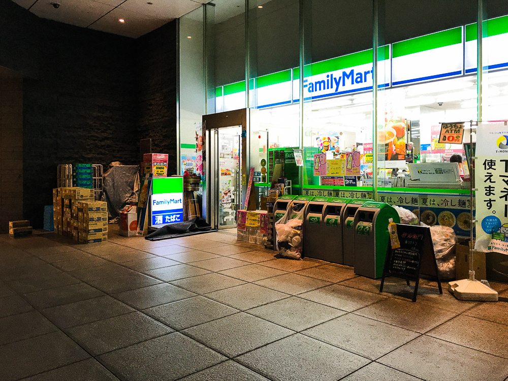
Just what, I hear you ask, is the magnetic pull of the Japanese Convenience store or Konbini as they are known ?
-
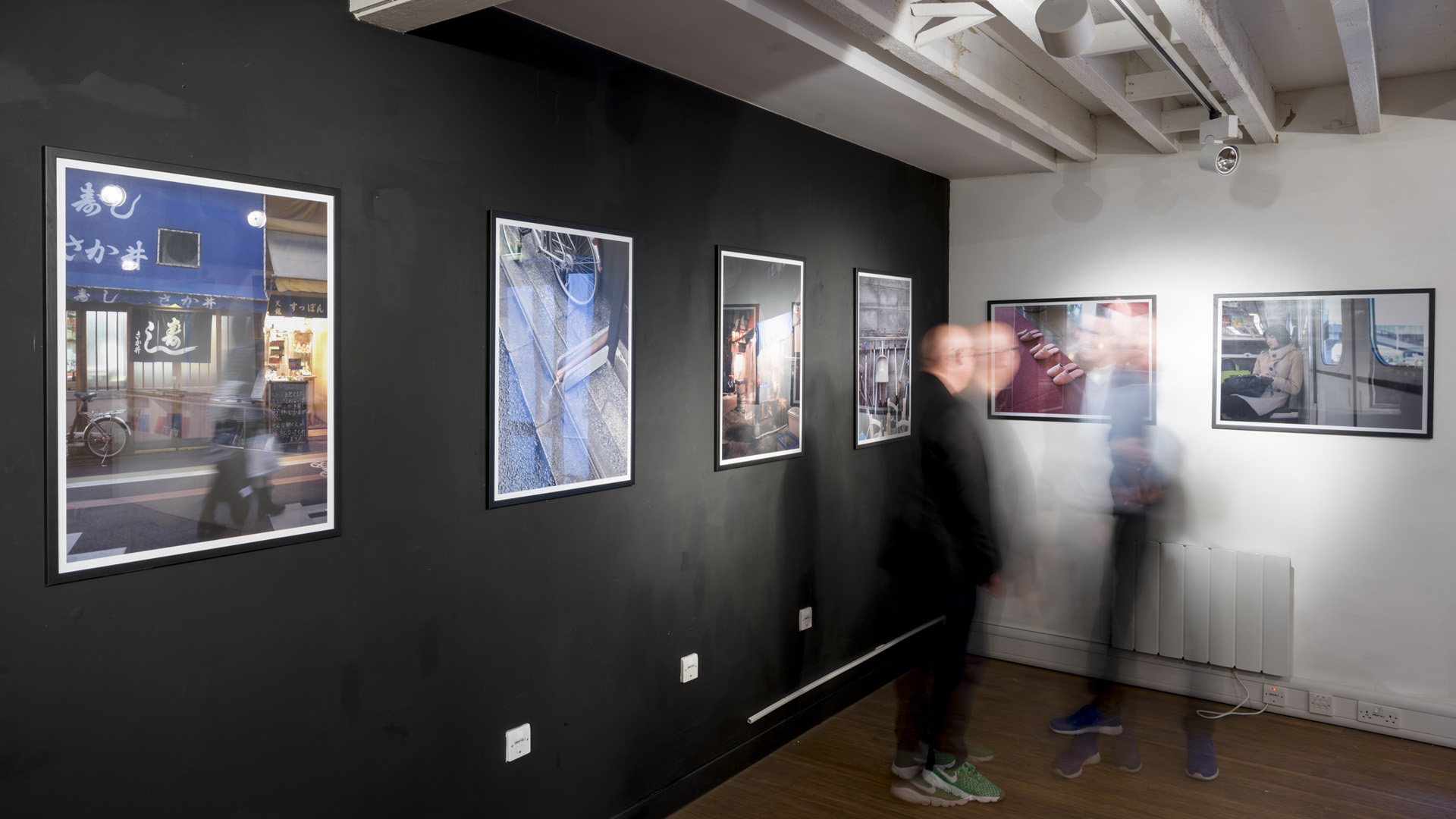
Pictures of Japan
Japanese bathroom ceramic ware maker TOTO invited me to curate a small collection of these photographs for their 100th year anniversary during Clerkenwell Design Week in London.
-
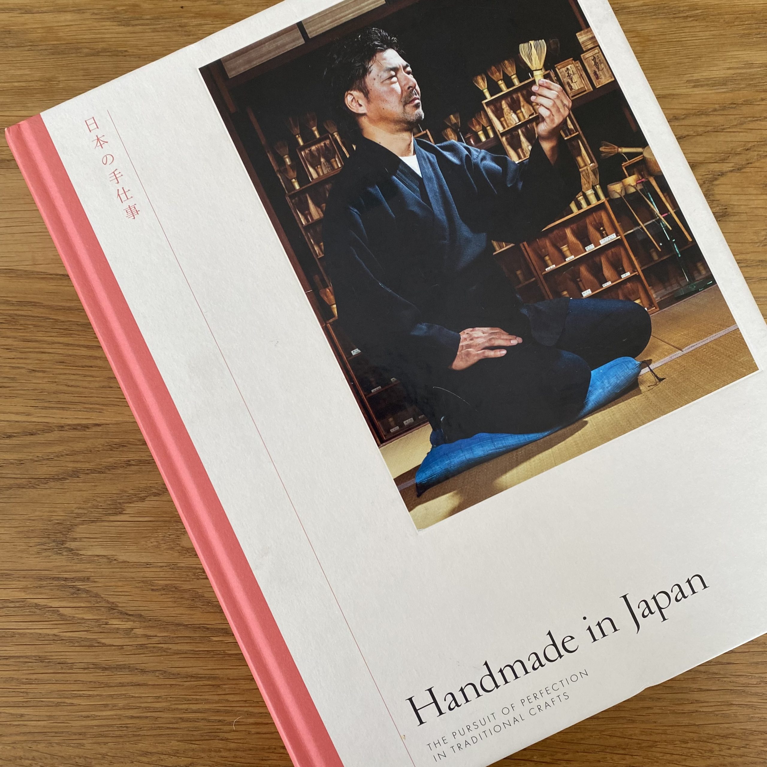
Handmade in Japan
If like me you have an appetite for exploring all things related to Japanese design and crafts, Irwin Wong’s introduction to Handmade in Japan will surely prompt you to investigate further