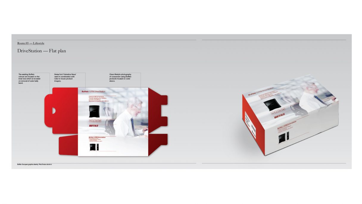
Buffalo are a Japanese computer peripheral maker. Highly respected in the global IT community they make high-spec and reliable products. Previous projects have included designing products and improving their identity.
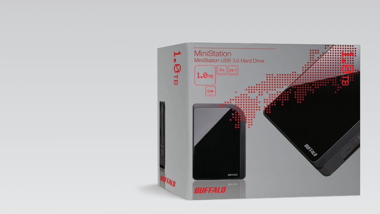
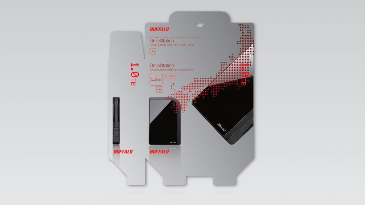
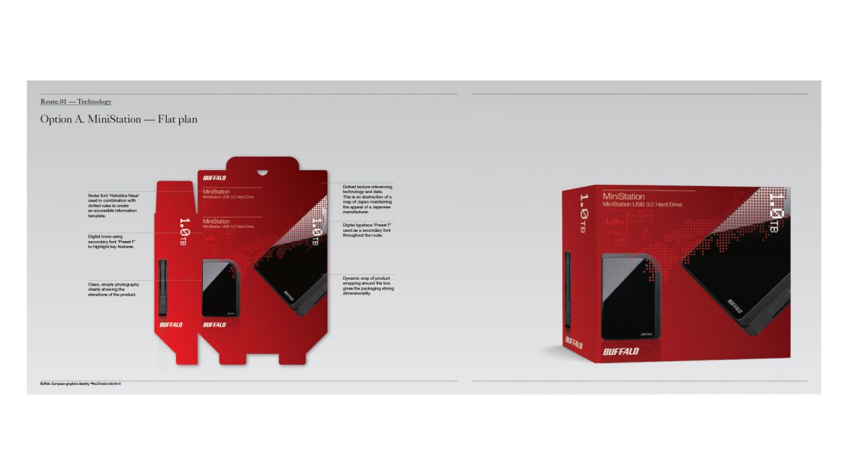
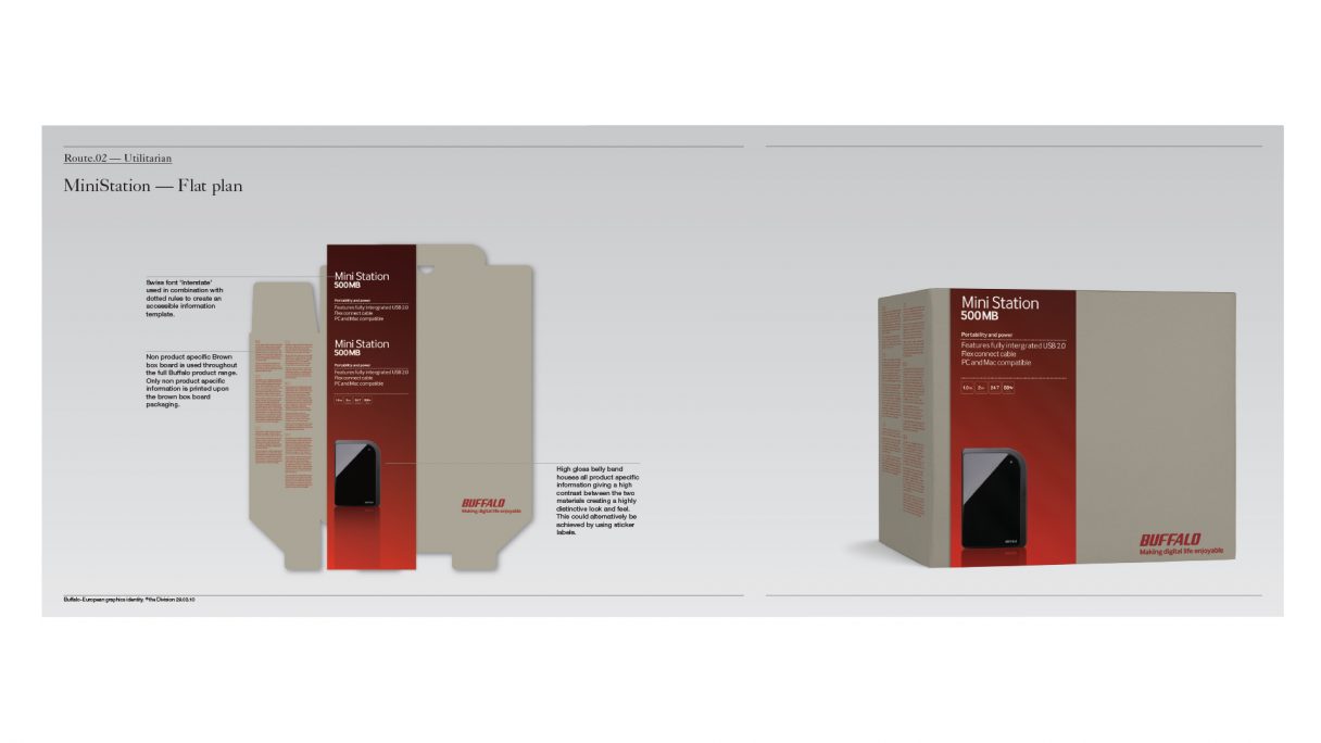
The project goal was to create fresh packaging, clearly communicating the technical credentials of their products and aesthetically appealing to European and US consumers. We created a range of concepts, from technology and eco-friendly to lifestyle and the aspirational.
All of the proposals are a strong contrast to the typical Japanese technology packaging and retailing, which is visually noisy and focused on technical specification.
Buffaloは日本のコンピューター周辺機器メーカーです。ハイスペックで信頼のおけるプロダクトの製造で、グローバルITコミュニティから高い評価を受けています。過去のプロジェクトでは、プロダクトのデザインやBuffaloのアイデンティティー向上に取り組みました。
このプロジェクトのゴールは、新鮮なパッケージを作成し、プロダクトの技術的な情報を明確に伝え、ヨーロッパとアメリカの消費者を美的に引き付けることでした。私たちは技術的なもの、環境に優しいものから、ライフスタイルを反映したもの、野心的なものまで、さまざまなコンセプトを生み出しました。
全ての提案は、視覚的にノイズが多く専門的なスペックに焦点をあて技術を伝えることをより重要視した典型的な日本のパッケージや小売りとは、大きく違うものとなりました
RELATED
-
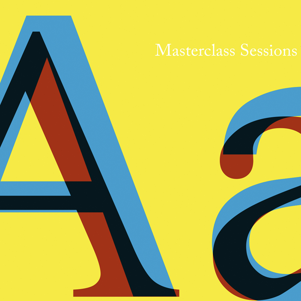
Brother – Typography 101
Our 2-3 day work session introduces attendees to the fundamentals of fonts and grids and their use in print and digital applications.
-
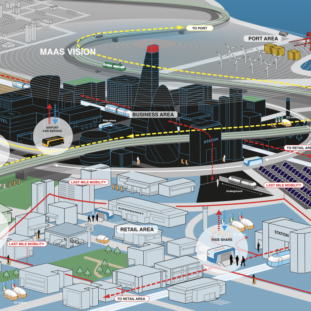
Denso – Future Mobility
Denso are trying to utilise their Automotive knowledge in the future transport landscape
-
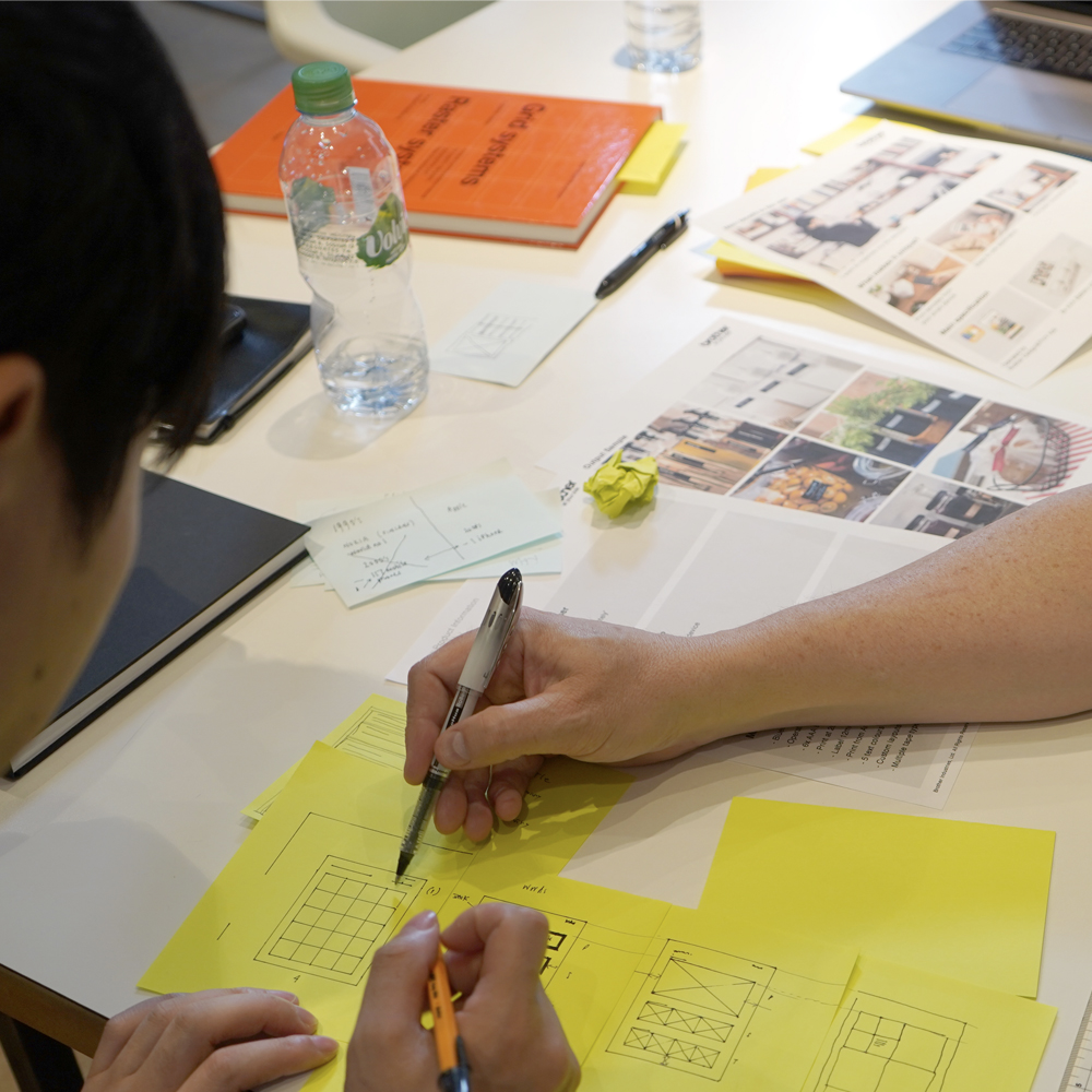
Brother – Communications Methodology
Brother’s brief was to improve the design of sales materials such as – internal presentations, product packaging, product literature,